
5 Sermon Graphic Styles to Try for Your Next Series
Your sermon graphics don't all have to look the same. Five distinct visual styles, with example titles and the sermon themes each one fits best.
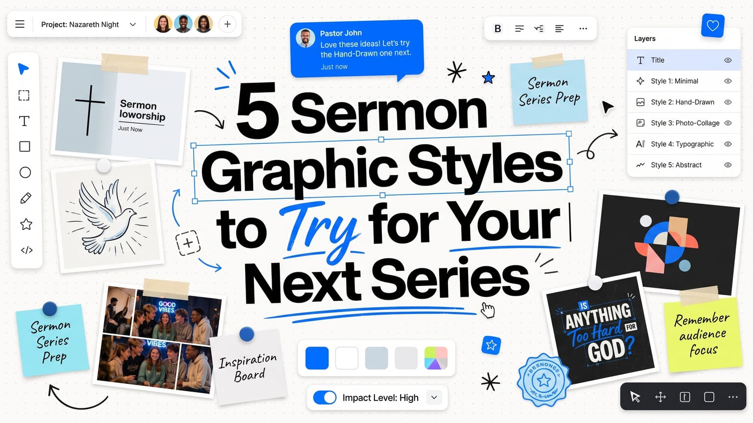
Your sermon graphics don’t all have to look the same. A style that works for a series on identity will not automatically work for a series on courage, and reusing the same look every week can make even a strong sermon topic feel flat.
Here are five distinct visual styles worth trying, what each one communicates, and the kind of sermon theme it fits best.
1. Surveillance System
Dark photography meets security cameras, tracking interfaces, scan lines, coordinates, and technical overlays. The mood is watchful and a little tense, closer to a spy film than a church graphic.
This style fits themes about being seen, searched, watched, known, or chosen. Recent examples include “God Sees” (a lone figure caught in a security frame at a crosswalk), “Unshakable Faith,” and “Search Me,” built around Psalm 139:23-24, which asks God to search the heart.
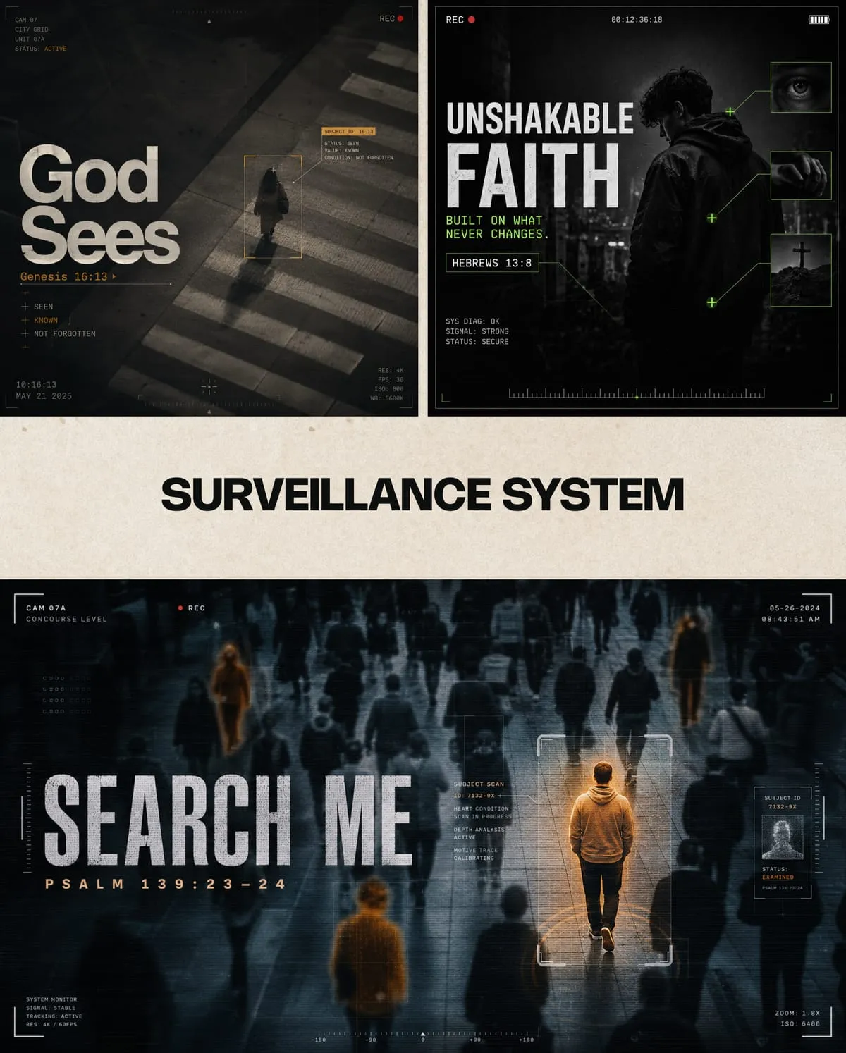
Use it when the message is about God’s knowledge of us specifically, not vague omniscience. The technical, tracking-interface look only works if the theme is genuinely about being seen or found.
2. Biblical Blockbuster
Treat the message like the biggest story ever told. Cinematic environments, dramatic lighting, epic scale, and typography that feels worthy of a movie poster.
This is the style for narrative moments: a specific scene from scripture rather than a topical theme. Examples include “The Stone Rolled Away” (the empty tomb at sunrise), “The Reluctant Prophet” (Jonah, framed against a storm at sea), and “The Road to Damascus” (Acts 9:3, Paul knocked to the ground by a beam of light).
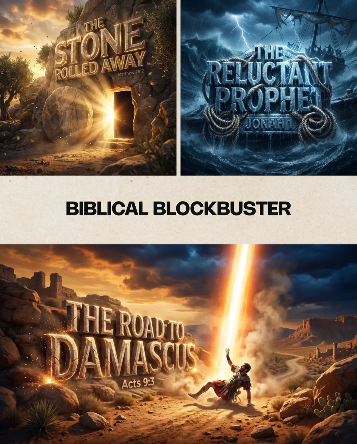
Reach for this one when you’re preaching straight through a Bible story and want the graphic to feel like a scene from the text, not an abstract concept.
3. Midcentury Bible Panels
Biblical storytelling through bold geometry, simplified illustrations, symbolic panels, and a restrained retro palette. It’s a great way to tell a whole story in one graphic instead of a single frozen moment.
Because the style breaks a story into panels, it works well for series that move through several beats of one narrative: “Let My People Go” (Exodus 5:1) can show Pharaoh, Moses, and the exodus itself in one composition. “The Reluctant Prophet” and “A Heart After God” (1 Samuel 13:14) work the same way, compressing a fuller arc into a single retro-styled graphic.
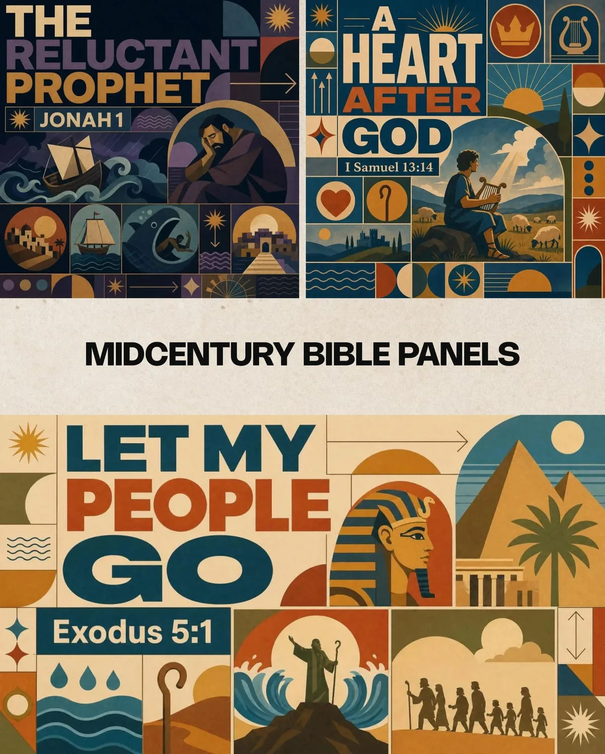
Choose this style when one image needs to summarize a story arc, not just set a mood.
4. Trinket Charm
Turn the sermon into a collection of tiny symbolic objects. Glossy lettering, jewelry-like details, charms, icons, gems, and mini story references packed into one tactile design.
This is the style to reach for on lighter, more celebratory themes: “Jesus Saves” (a charm bracelet of fish, cross, crown, and lighthouse icons), “Facing Giants” (1 Samuel 17, David and Goliath rendered as charms), and “Far Above Rubies,” built for a ladies’ conference with keys, gems, and a crown.
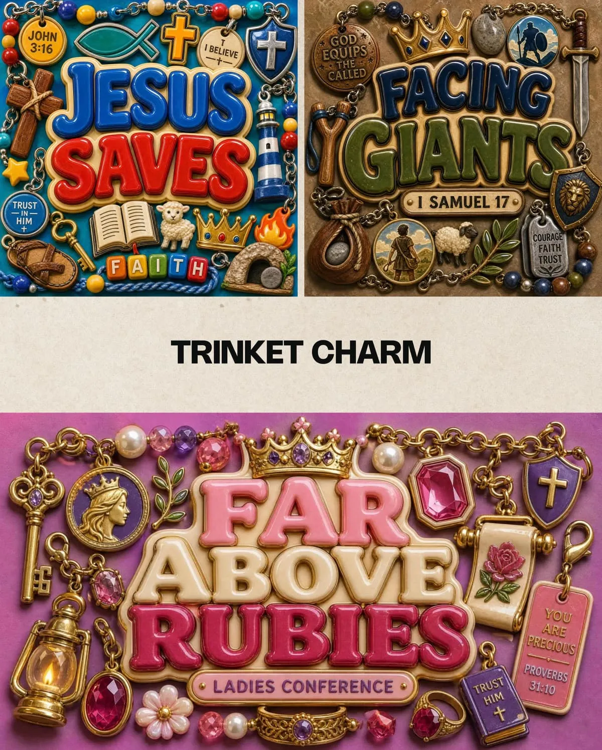
It reads as warm and personal rather than epic, which makes it a strong fit for women’s events, kids’ ministry, or any series built around a short list of symbolic ideas.
5. Gospel Zine
Torn paper, gritty textures, bold type, scribbles, halftones, and layered collage. Perfect when you want something raw, youthful, and full of energy instead of polished.
Recent examples include “Walking Through the Storm” (Matthew 8:23-27), “Chosen” (1 Peter 2:9), and “Armor of God” (Ephesians 6:10-18). The collage format handles action-oriented, spiritual-warfare, and identity themes especially well.
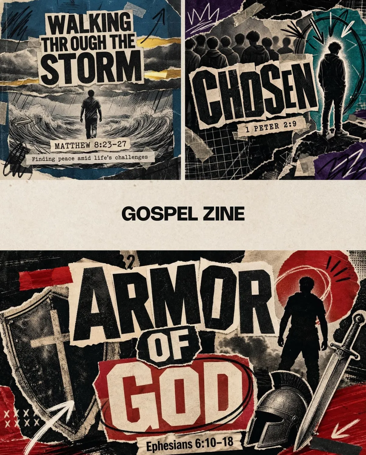
This style works best for youth ministry, young adult series, or any message that calls for urgency over reverence.
Quick pick guide
If you already know the feeling you’re going for, start here:
- Theme is about being known, seen, or searched by God: Surveillance System
- Theme follows one specific Bible narrative or scene: Biblical Blockbuster
- Theme needs to summarize a whole story arc in one graphic: Midcentury Bible Panels
- Theme is warm, celebratory, or built around a short list of symbols: Trinket Charm
- Theme is urgent, youth-facing, or about spiritual warfare: Gospel Zine
Picking a style for your next series
Start with the feeling you want people to remember after the sermon ends, not the calendar or what you used last time. A watchful, personal theme points toward Surveillance System. A specific Bible narrative points toward Biblical Blockbuster or Midcentury Bible Panels, depending on whether you need one scene or a full story arc. A warm, symbolic theme points toward Trinket Charm. An urgent, youth-facing theme points toward Gospel Zine.
Once you land on a style, stay with it for the length of the series. Church Canvas can generate sermon graphics in any of these directions from a plain-language prompt, in the same style, week after week, so your series looks like one connected message instead of five different graphics that happen to share a scripture reference.
If you want a closer look at what separates a strong graphic from a cluttered one inside any of these styles, our breakdown of three real Church Canvas designs walks through the details. For more finished examples across every style, browse the Church Canvas community feed.
Sermon graphic style FAQ
How do I choose a style for my sermon series?
Start with the mood of the message, not the calendar. A series on identity or being known fits a different visual language than a series on courage or a Bible narrative. Match the style to the feeling you want people to remember, then keep it consistent for the whole series.
Can I mix styles within one sermon series?
You can, but it's usually better to pick one style for the full series and save variety for the next one. Switching styles mid-series can make a sermon feel disconnected from the ones before it, even if each individual graphic looks good.
Do these styles work for social media too?
Yes. Each style translates to widescreen slides, square posts, and vertical stories. Generate the sermon graphic first, then reframe it for whichever size your service or feed needs.
Is it okay to reuse the same style every week?
Yes, especially for weekly series or recurring segments. Consistency builds recognition. Save style changes for new series, seasons, or standalone events so the shift actually signals something to your congregation.
Where can I see more example styles?
Browse the Church Canvas style library in-app, or see finished graphics from other churches in the Community Feed for ideas before you generate your own.