
What Makes a Church Graphic Work? 3 Designs, Broken Down
Three real church sermon graphics broken down: what makes each design work, what falls short, and design principles you can reuse in your own graphics.
Good church graphics are not just beautiful. They guide the eye, clarify the message, and make the idea easier to remember. Here are three real sermon graphics, each generated with Church Canvas from a plain-language prompt, broken down for what works, what falls short, and what any church team can borrow for their own designs.
1. “The Strong Tower”: bold type built into the artwork
Style: Experimental Type Grid. Bold typography structured like a grid, merging type and image for a strong poster feel.
Prompt: The title is “The Strong Tower.” Text that says “Proverbs 18:10.” Mood: bold, gritty, heroic. Additional objects: castle towers, stone walls, banners, shields, clouds, flags.
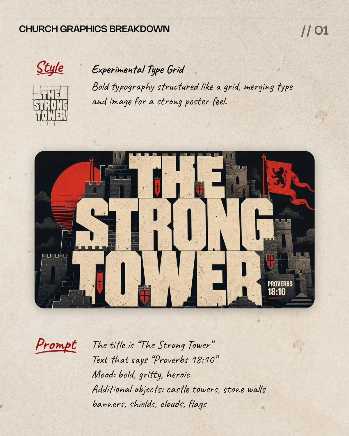
The oversized title becomes the hero image, and castle shapes are built directly into the letterforms instead of sitting on top of them. Battlements and towers merge with the typography, so the title and the artwork read as one piece, not two.
A few choices make this one work:
- A limited palette. Cream, charcoal, and red keep the design cohesive and memorable instead of busy.
- Red accents that guide the eye. The flags, banner, and shields create controlled emphasis across the layout rather than scattering attention.
- A small, secondary verse reference. Proverbs 18:10 is visible but never competes with the main message.
- Repeated shapes that frame the composition. The castle towers repeat around the title and give the eye a place to land.
Nothing here feels randomly added. The title, towers, texture, color palette, and supporting details all feel like part of one visual system.
2. “Rooted in the Word”: a strong idea that got crowded
Style: Center Stage. One dominant subject occupies the center while supporting elements frame it and direct attention toward the main focal point.
Prompt: The title is “Rooted in the Word.” Text that says “Psalm 1:1-3.” Mood: grounded, vibrant, hopeful. Additional objects: large central tree, exposed roots, soil cross-section, warm sunlight, stars, arrows, spirals.
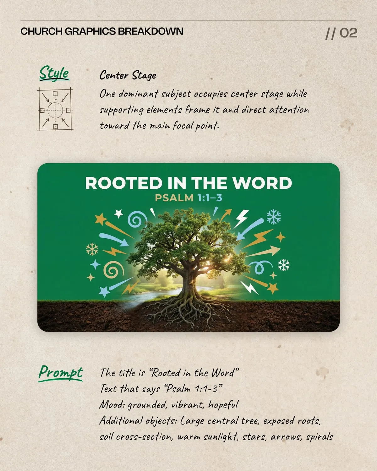
The idea is solid. A glowing tree with exposed roots and a soil cross-section is a strong visual for Psalm 1, and the concept clearly carries the whole message.
The execution is where this one runs into trouble:
- Decorative symbols add visual noise. Extra icons compete with the tree instead of supporting the message.
- The title feels detached from the image. The typography style does not match the artwork, so the text sits apart from the scene instead of feeling integrated.
- The background transition feels unfinished. The landscape fades awkwardly into flat green.
- The verse reference doesn’t need two colors. A single, calmer color would make the reference feel more finished and less scattered.
- The roots and soil don’t feel connected. The oversized root system makes the tree feel planted, not naturally growing.
This is a common pattern: a strong central idea gets buried under extra details that were meant to support it. Simplifying the scene, fewer icons, one title treatment that matches the art style, a cleaner transition into the background, would make the message much clearer without losing the concept.
3. “Is Anything Too Hard for God?”: a clear visual path
Style: Epic Radiance. Dramatic light, deep shadows, and cinematic scale create an epic, reverent atmosphere.
Prompt: The title is “Is anything too hard for God?” Text that says “Luke 1:37.” Mood: epic, reverent, hopeful. Additional objects: radiant star, vertical beam of light, lone silhouette, ancient city, palm trees, dark night sky.
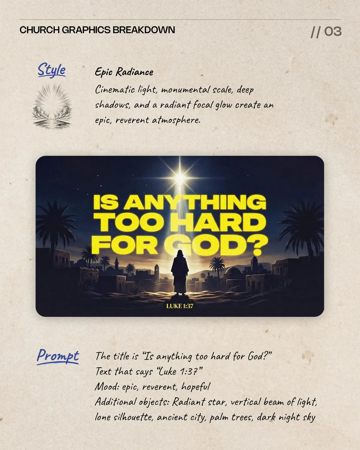
This design has a clear visual path: a bright star draws the eye first, then the oversized title, then a lone silhouette, then the small scripture reference. Each element hands attention to the next one in order.
What makes the sequence work:
- An oversized title grabs attention. The large type communicates the message instantly and gives the graphic immediate impact.
- A bright focal point anchors the composition. The glowing star sets the tone before the eye even reaches the title.
- Strong contrast keeps it readable. Light-colored type against a dark night sky is easy to read at a glance.
- A human silhouette adds emotional weight. The lone figure gives the message a personal, human anchor instead of leaving it abstract.
- A centered, stable composition. The balanced layout keeps focus on the message instead of competing distractions.
The strong contrast and centered composition make the idea easy to understand in a split second while still creating real emotional weight.
What these three examples have in common
Set side by side, the strongest of the three designs share the same habits, and the weakest one is missing exactly one of them:
- One focal point, not several. Oversized type, a central figure, or a bright light source, pick one thing for the eye to find first.
- A palette with a limit. Two to four colors read as intentional. More than that starts to feel scattered.
- Supporting details that repeat or reinforce, not decorate. Every extra symbol should either frame the focal point or echo the message. If it does neither, cut it.
- Typography that matches the art style. Type built into the scene reads as one design. Type placed on top of unrelated art reads as two.
- A verse or reference that stays secondary. Visible, legible, and never competing with the main message.
Before you ship your next graphic, run it against that list. If you can point to a single focal point, a short color palette, and a title that feels built into the art rather than dropped on top of it, you’re most of the way there.
How to write a prompt that gets you there
All three graphics above came from a plain-language prompt in Church Canvas, and each prompt followed the same basic shape:
- The title, word for word. “The Strong Tower,” “Rooted in the Word,” “Is anything too hard for God?” Say exactly what the graphic needs to say.
- The reference, if there is one. A verse, a series name, or an event date. Keep it short.
- A mood in two or three words. “Bold, gritty, heroic” reads very differently from “grounded, vibrant, hopeful,” and the AI leans into that difference.
- A short list of supporting objects. Not a paragraph. The strongest example above listed six objects (castle towers, stone walls, banners, shields, clouds, flags), and every one of them showed up in the design doing a job.
A vague prompt produces a vague graphic, in Church Canvas or any other tool. Naming your mood and giving a short, specific list of supporting objects is what turns a generic result into a graphic with one clear focal point instead of a cluttered scene.
If you want more examples like these, browse the Church Canvas community feed or start with your own sermon graphics. And if cluttered layouts are a recurring problem for your team, our piece on common church design mistakes covers the habits behind it.
Church graphic design FAQ
What makes a church graphic effective?
An effective church graphic guides the eye to one focal point, keeps the message clear at a glance, and uses a limited color palette so nothing competes for attention. Style and mood matter, but only if they support the message instead of decorating it.
Why do busy layouts hurt church graphics?
Extra symbols, icons, and effects add visual noise. When too many elements compete for attention, viewers cannot tell what the graphic is actually about, and the core message gets lost in the decoration.
How many focal points should a church graphic have?
One. A single dominant subject, whether that is oversized type, a central image, or a strong light source, gives the eye somewhere to land first. Supporting elements should frame that focal point, not pull attention away from it.
Does the title need to match the artwork style?
Yes. When typography feels bolted on instead of built into the design, like a generic font sitting on top of unrelated art, the graphic reads as two separate pieces instead of one cohesive message.
Can AI-generated graphics still follow strong design principles?
Yes. The prompt still has to describe a clear subject, mood, and limited set of supporting details. Church Canvas turns that prompt into a finished design, but a vague or overcrowded prompt produces a vague or overcrowded graphic, the same way it would with any other tool.